Payment Methods Styles Props
You can customize the Authorize Module to integrate better with your website's design style. For this, you can use the optional parameters style and labels when calling the window.listOfpaymentMethodsConfig function.
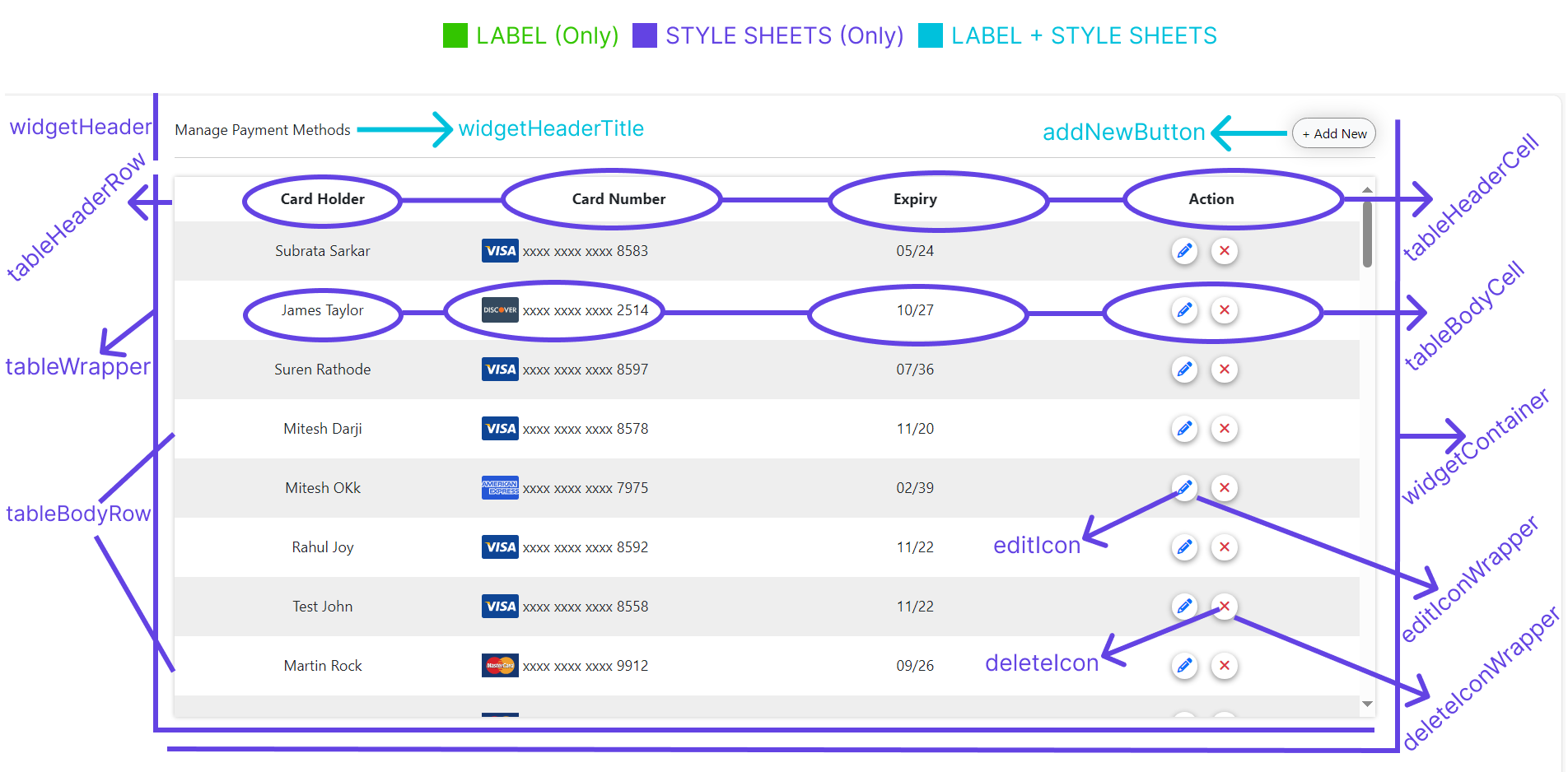
List Of Payment Methods Page
You can customize the following properties in your List Of Payment Methods page:
Labels
| Prop Name | Type | Description | Default Value |
|---|---|---|---|
widgetHeaderTitle | string | The title displayed in the header of the widget container. | Manage Payment Methods |
addNewButton | string | The label for the "Add New" button used to add a new entry. | Add New |
loadingText | string | The caption displayed while the widget is in a loading state. | Loading |
tableHeaderColumns | array or list | The table header labels for displaying card details in columns. | ['Card Holder', 'Card Number', 'Expiry', 'Action'] |
Styles
| Prop Name | Description |
|---|---|
widgetContainer | The main container or wrapper for the entire page widget. |
widgetHeader | The header of the widget, containing the "Manage Payment Methods" label and the "Add New" button. |
widgetHeaderTitle | The title displayed in the widget header, typically labeled "Manage Payment Methods." |
addNewButton | The button labeled "Add New" for adding new entries. |
loadingText | The text or spinner displayed during loading states. |
tableWrapper | The container or scrollable div that wraps the table. |
tableHeaderRow | The row representing the header section of the table. |
tableHeaderCell | The individual cells or columns within the table header. |
tableBodyRow | The row representing the body section of the table. |
tableBodyCell | The individual cells or columns within the table body. |
editIconWrapper | The container for the edit icon. |
editIcon | The icon used to edit table entries. |
deleteIconWrapper | The container for the delete icon. |
deleteIcon | The icon used to delete table entries. |
Each property above must receive an object as the value. This value can contain style and cssClass keys:
| Key | Type | Description |
|---|---|---|
style | object | An object containing valid CSS styles that will be applied to the HTML element. |
cssClass | string | A class name to be added to the HTML element, allowing for custom styling via CSS. |
Example Usage
The image below shows what each available property affects:
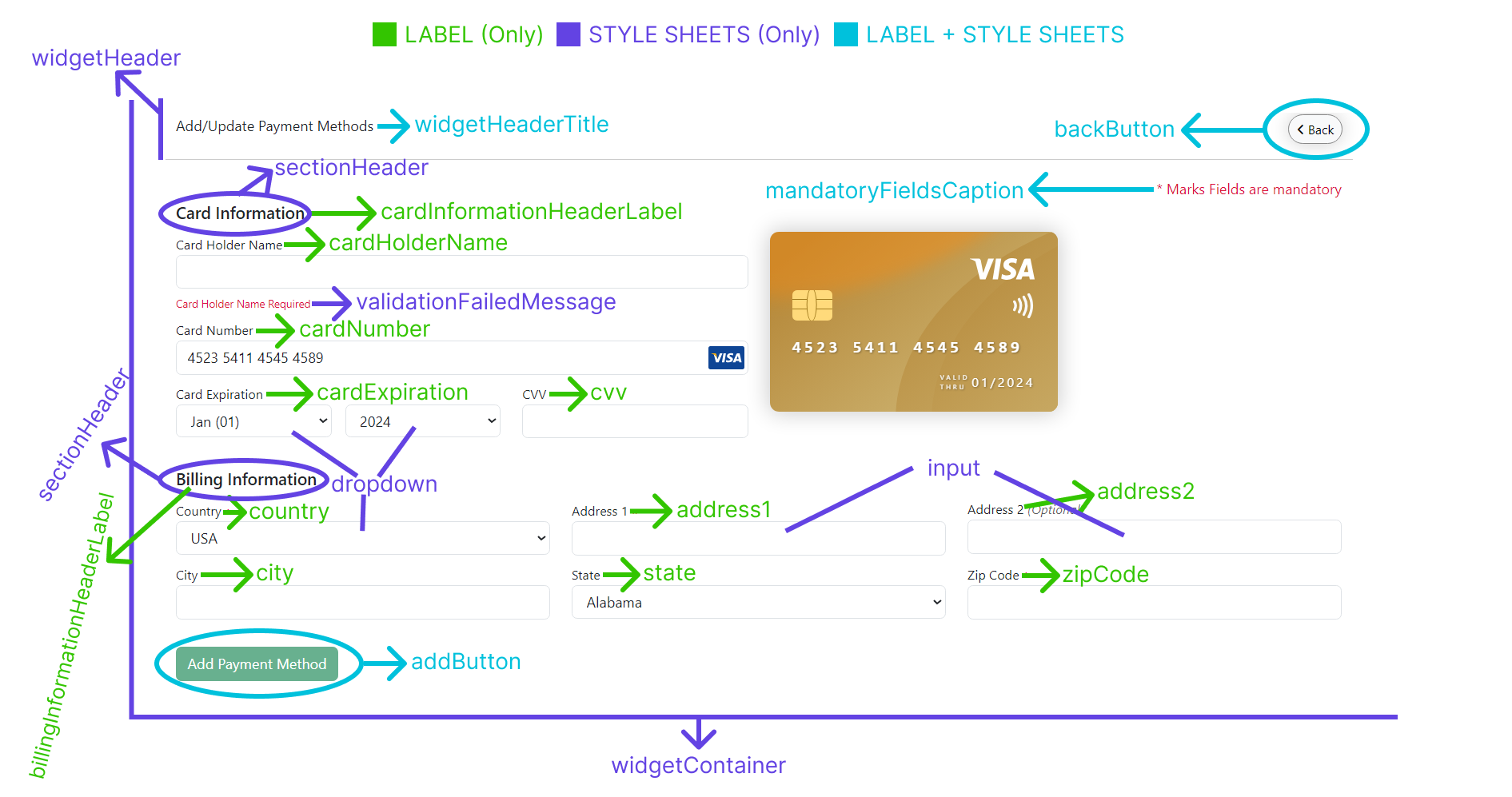
Add Or Update Payment Method Page
Use the following properties to customize styles and labels, and also uiConfig for the add or update payment method page:
Labels
| Prop Name | Type | Description | Default Value |
|---|---|---|---|
widgetHeaderTitle | string | The title displayed in the widget header. | Add/Update Payment Methods |
mandatoryFieldsCaption | string | The caption indicating mandatory fields in the form. | * Marks Fields are mandatory |
cardInformationHeaderLabel | string | The section header label for the "Card Information" section. | Card Information |
billingInformationHeaderLabel | string | The section header label for the "Billing Information" section. | Billing Information |
cardHolderName | string | The label for the cardholder name input field. | Card Holder Name |
cardNumber | string | The label for the card number input field. | Card Number |
cardExpiration | string | The label for the card expiration dropdown field. | Card Expiration |
cvv | string | The label for the CVV input field. | CVV |
country | string | The label for the country dropdown field. | Country |
address1 | string | The label for the first address input field. | Address 1 |
address2 | string | The label for the second address input field. | Address 2 |
city | string | The label for the city input field. | City |
state | string | The label for the state dropdown or input field. | State |
zipCode | string | The label for the zip code input field. | Zip Code |
updateButton | string | The label for the update payment methods button. | Update |
addButton | string | The label for the add payment methods button. | Add Payment Method |
Styles
| Prop Name | Description |
|---|---|
widgetContainer | The main page or widget container. |
widgetHeader | The widget header containing the "Manage Payment Methods" label and the back button. |
backButton | The button to navigate back to the previous screen. |
widgetHeaderTitle | The caption for the "Manage Payment Methods" section. |
mandatoryFieldsCaption | Caption indicating mandatory fields, with a default text color of crimson. |
sectionHeader | Section headers for "Card Information" and "Billing Information". |
label | Labels for form inputs, dropdowns, or radio buttons. |
input | Input fields or textboxes in the form. |
dropdown | Dropdown fields in the form. |
updateButton | Button labeled "Update" for updating payment methods. |
addButton | Button labeled "Add Payment Method" for adding new payment methods. |
uiConfig
The uiConfig parameter allows you to add two boolean props to it:
| Prop Name | Type | Description | Default Value |
|---|---|---|---|
showCardImage | boolean | Controls the visibility of the card image. If true, the card image is visible. Set to false to hide it. | true |
showBillingInfo | boolean | Controls the visibility of the billing information section. If true, the section is visible. Set to false to hide it. | true |
Example Usage
The image below shows what each available property affects:
Full Code Example
The code block below presents a complete example with all available parameters for the window.authorizePaymentConfig function:
Example
window.addPaymentMethodsConfig = {
  customerReference: "123545745454",
  merchantIdentifier: "ACVX458KJGJLAS7878DSADS",
  labels: {
    widgetHeaderTitle: "Add/Update Payment Methods",
    mandatoryFieldsCaption: "* Marks Fields are mandatory",
    cardInformationHeaderLabel: "Card Info",
    billingInformationHeaderLabel: "Billing Info",
    cardHolderName: "Holder Name",
    cardNumber: "Number",
    cardExpiration: "Expiry",
    cvv: "CVV",
    country: "Country",
    state: "StRegonate",
    address1: "Street",
    address2: "Street 1",
    city: "CITY",
    zipCode: "Zip",
    updateButton: "Update",
    addButton: "Add Payment Method",
    backButton: "Back"
  },
  styles: {
    widgetContainer: {
      style: {
        padding: "20px",
        backgroundColor: "#f9f9f9"
      },
      cssClass: "widget-container-class"
    },

    widgetHeader: {
      style: {
        display: "flex",
        justifyContent: "space-between",
        alignItems: "center",
        paddingBottom: "10px",
        borderBottom: "1px solid #ddd"
      },
      cssClass: "widget-header-class"
    },
    backButton: {
      style: {
        backgroundColor: "#e0e0e0",
        border: "none",
        padding: "8px 16px",
        cursor: "pointer"
      },
      cssClass: "back-button-class"
    },
    input: {
      style: {
        border: "2px dashed cyan",
        padding: "10px",
        borderRadius: "4px"
      },
      cssClass: "input-class"
    },
    dropdown: {
      style: {
        padding: "10px",
        borderRadius: "4px"
      },
      cssClass: "dropdown-class"
    },
    sectionHeader: {
      style: {
        color: "purple",
        fontWeight: "bold",
        marginTop: "20px",
        marginBottom: "10px"
      },
      cssClass: "section-header-class"
    },
    label: {
      style: {
        display: "block",
        marginBottom: "5px",
        fontWeight: "600"
      },
      cssClass: "label-class"
    },
    payButton: {
      style: {
        backgroundColor: "#28a745",
        color: "#fff",
        border: "none",
        padding: "10px 20px",
        cursor: "pointer",
        borderRadius: "4px"
      },
      cssClass: "pay-button-class"
    },
    updateButton: {
      style: {
        backgroundColor: "#007bff",
        color: "#fff",
        border: "none",
        padding: "10px 20px",
        cursor: "pointer",
        borderRadius: "4px"
      },
      cssClass: "update-button-class"
    },
    addButton: {
      style: {
        backgroundColor: "#17a2b8",
        color: "#fff",
        border: "none",
        padding: "10px 20px",
        cursor: "pointer",
        borderRadius: "4px"
      },
      cssClass: "add-button-class"
    },
    tableWrapper: {
      style: {
        overflowX: "auto",
        marginTop: "20px"
      },
      cssClass: "table-wrapper-class"
    },
    tableHeaderRow: {
      style: {
        backgroundColor: "#f1f1f1"
      },
      cssClass: "table-header-row-class"
    },
    tableHeaderCell: {
      style: {
        padding: "10px",
        textAlign: "left",
        borderBottom: "1px solid #ddd"
      },
      cssClass: "table-header-cell-class"
    },
    tableBodyRow: {
      style: {
        borderBottom: "1px solid #ddd"
      },
      cssClass: "table-body-row-class"
    },
    tableBodyCell: {
      style: {
        padding: "10px",
        textAlign: "left"
      },
      cssClass: "table-body-cell-class"
    },
    editIconWrapper: {
      style: {
        display: "inline-block",
        cursor: "pointer"
      },
      cssClass: "edit-icon-wrapper-class"
    },
    editIcon: {
      style: {
        width: "16px",
        height: "16px",
        fill: "#007bff"
      },
      cssClass: "edit-icon-class"
    },
    deleteIconWrapper: {
      style: {
        display: "inline-block",
        cursor: "pointer"
      },
      cssClass: "delete-icon-wrapper-class"
    },
    deleteIcon: {
      style: {
        width: "16px",
        height: "16px",
        fill: "#dc3545"
      },
      cssClass: "delete-icon-class"
    }
  },
  uiConfig: {
    showCardImage: true,      // Default: true (Card image is visible)
    showBillingInfo: true     // Default: true (Billing information section is visible)
  }
};